Visual Component Library is a set of CSS 80+ compatible components which cover most of the styling needs of a modern mobile or web application. Here are some good things about VCL:
- Modularity: you can use each of the modules separately or combine modules as you want
- Build Tools: you can create your own builds of VCL modules that you need.
- Documentation: you can generate documentation for modules you need and share it with your colleagues or ship it with your code.
- Extensibility: you can combine VCL modules with your own project styles; you can extend and author VCL modules easily
- Completeness: VCL contains 85 modules that cover almost everything. If something is missing, see the
extensibilitypoint - Size: all core modules of VCL take ~25KB (gzipped, minified)
- Development Workflow: VCL provides the tools to develop and test VCL modules separately from the project.
VCL is made to work well with component-based approach to Web development. So you can easily integrate VCL with frameworks such as Ember, React or Angular.
Sounds interesting? Let’s do some getting started training.
Getting Started
Most of the tooling for VCL is written in JS and therefore one can use NPM to install and update VCL components. Let’s create a new project and install VCL core modules:
- Create an empty directory
  mkdir vcl-tutorial
  cd vcl-tutorial
- Install Gulp
npm install gulp gulp-concat --save-dev
- Install VCL preprocessor plugin for Gulp as well as core modules of VCL and the default VCL theme:
npm install vcl/gulp-vcl-preprocessor vcl/default-theme vcl/default-theme-terms vcl/core-modules --save-dev
- Create
gulpfile.jswith the following code:
var vcl = require('gulp-vcl-preprocessor');
var gulp = require('gulp');
var concat = require('gulp-concat');

gulp.task('default', function(){
  return gulp.src('styles/*.styl')
    .pipe(vcl())
    .pipe(concat('style.css'))
    .pipe(gulp.dest('.'));
});
The default task loads your project styles from the styles folder, passes them to the vcl preprocessor and outputs the result into style.css
- Let’s take a look what
stylesfolder can look like. Create a filestyles/index.stylwith the following content:
@import "vcl-default-theme-terms"
@import "vcl-default-theme"
@import "vcl-core-modules"
This file imports the following VCL modules: the default theme terms, the default theme itself and the core modules.
-
Now run
gulpin your project folder and you will see thatstyles.csswas generated. Of course, it’s a good idea to minimize the resulting file and use autoprefixer to ensure compatibility with all browsers but that’s not part of VCL. -
Let’s add some
index.html:
<!doctype html>

<html lang="en">
<head>
  <meta charset="utf-8">

  <title>VCL tutorial</title>
  <meta name="description" content="VCL tutorial">
  <meta name="author" content="Alex">

  <link href="https://maxcdn.bootstrapcdn.com/font-awesome/4.4.0/css/font-awesome.min.css" rel="stylesheet">
  <link rel="stylesheet" href="style.css">
</head>

<body>
  <nav class="vclNavigation">
    <ul>
      <li class="vclNavigationItem" role="presentation"
        aria-selected="false" tabindex="0">
        <a class="vclNavigationItemLabel vclIcogram" href="#"
        tabindex="-1">
          <span class="vclIcon fa fa-home" aria-hidden="true"
          aria-label="home" role="img"></span>
          <span class="vclText">Home</span>
        </a>
      </li>
      <li class="vclNavigationItem vclSelected" aria-selected="true"
       tabindex="0">
        <a class="vclNavigationItemLabel vclIcogram" href="#" tabindex="-1">
          <span class="vclIcon fa fa-envelope" aria-hidden="true"
          aria-label="envelope" role="img"></span>
          <span class="vclText">Contact</span>
        </a>
      </li>
      <li class="vclNavigationItem" role="presentation"
        aria-selected="false" tabindex="0">
        <a class="vclNavigationItemLabel vclIcogram" href="#" tabindex="-1">
          <span class="vclIcon fa fa-bicycle" aria-hidden="true"
            aria-label="bicycle" role="img"></span>
          <span class="vclText">Products</span>
        </a>
      </li>
      <li class="vclNavigationItem" role="presentation"
      aria-selected="false" tabindex="0">
        <a class="vclNavigationItemLabel vclIcogram" href="#" tabindex="-1">
          <span class="vclText">Iconless item</span>
        </a>
      </li>
    </ul>
  </nav>
</body>
</html>
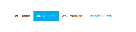
This HTML snippet is one of the demo examples for the VCL navigation component. The result is something like this:
This project setup can serve as a basis for real projects: you can include additional modules into index.styl or write your own CSS in there. VCL assumes the use of whitespace significant CSS syntax for styl files but you can import css files as well.
Development of VCL modules
VCL allows you to work with modules individually. Let’s take a look at pagination module:
git clone https://github.com/vcl/pagination.git
cd pagination
Let’s install dependencies with npm install and run the component demo:
npm start
This will start a web server and open the component’s demo. Simply change the component styles or the demo and refresh the page to see the changes. Run npm test to see if all components styles can be successfully compiled by the VCL preprocessor.